The Problem Before the Solution#
We built our own custom Vue component library at Walker & Dunlop. This is the story of why, and of the organizational work that took as much effort as the code itself.
The inconsistency was gradual enough that it snuck up on us. Over the years, the company grew through acquisitions. Each company that came in brought its own front-end practices and tooling. By the time we started seriously looking at the problem, we had projects running on Vuetify, others on Reka, some on ElementUI, and some using fully custom components with no shared foundation at all. Every team had made reasonable choices in isolation. Collectively, it created a fragmented front-end that was expensive to maintain and hard to scale.
That was problem one.
Problem two was control. Leaning on third-party libraries is a reasonable approach early on. But at a certain scale, the tradeoffs shift. A library goes stale, or Vue ships a major version and the library is slow to catch up, or a component doesn't do what your design needs and you end up writing a custom wrapper on top of it anyway. We were already doing that in a few places, maintaining extra code on top of tools we didn't control. That's added complexity with not much to show for it, and every piece of it is one more thing that can break.
Those two problems together made the case for building something we owned.
Why Not Just Standardize on a Third-Party?#
The obvious alternative was to pick one existing library and migrate everything onto it. We'd get standardization without paying to build something from scratch.
While researching the space, I talked through this with an engineer contact at GE Aviation. They had the opposite situation: all of their projects ran on Vuetify. They had similar frustrations around control and flexibility, components that didn't quite fit their needs, dependency on an external community, slow Vue 3 support early on. Some teams were writing their own components anyway. They had pushed internally for a custom library and couldn't get it across the line.
The reason was straightforward. They had consistency. Every project spoke the same language, even if that language had its limitations. Disrupting a working system for a custom solution was hard to justify on a business level when the gain wasn't clear enough.
Our situation was different; we didn't have consistency to protect. We were fragmented across multiple libraries with no shared foundation, so a custom library wasn't going to break a system that already worked. There wasn't one to break. It was simply the consolidation we needed, done deliberately this time.
Getting Buy-In#
I'd wanted to do this for about five years. There were earlier attempts that never got off the ground, proof of concepts that stalled before they could prove much of anything. What changed in 2024 wasn't that the problem got worse. It was that I could finally articulate it clearly and back it up with something real.
Before any production code was written, I spent months with technical leadership, engineering managers, and engineers across teams, understanding the pain points from every angle and building a shared picture of what we were actually trying to fix. Not everyone was on board. Some thought it was too ambitious. A few didn't think it was possible to pull off at our scale. The most common piece of feedback I got, in one form or another, was that it was too hard to do.
So I built one.
The proof of concept ended up being the turning point. Once people could actually see it working, the conversation stopped being about whether this was feasible and started being about how we'd get there. Some of the same people who had called it too hard were now asking when they could start using it. Leadership committed the time and the resources, and it became a real initiative instead of an idea I kept bringing up.
From there, I led the front-end council in carrying it out. The council is a group of seasoned front-end engineers from across teams, closer to a tech guild than a single team. We establish front-end practices across the company, build tooling for engineers, and work toward consistency in how things are built. I lead five other engineers, run our weekly meetings to work through initiatives and projects, and regularly take what we're doing back to managers and executives. The library started as an initiative I introduced there, and I led it from conception through delivery.
Over 14 months, we worked through every major decision: architecture, standards, tooling, quality gates, contribution processes, and rollout strategy. Design was involved throughout, not just Engineering. A component library that's disconnected from the design system is just more custom code with extra steps.
It was a multi-departmental effort. Not everyone got exactly what they wanted in the final product. That's true of any shared system built across teams with different needs and different opinions. The compromises made it more broadly useful than any single team's wishlist would have.
What We Built: Inside @wdtech/components#
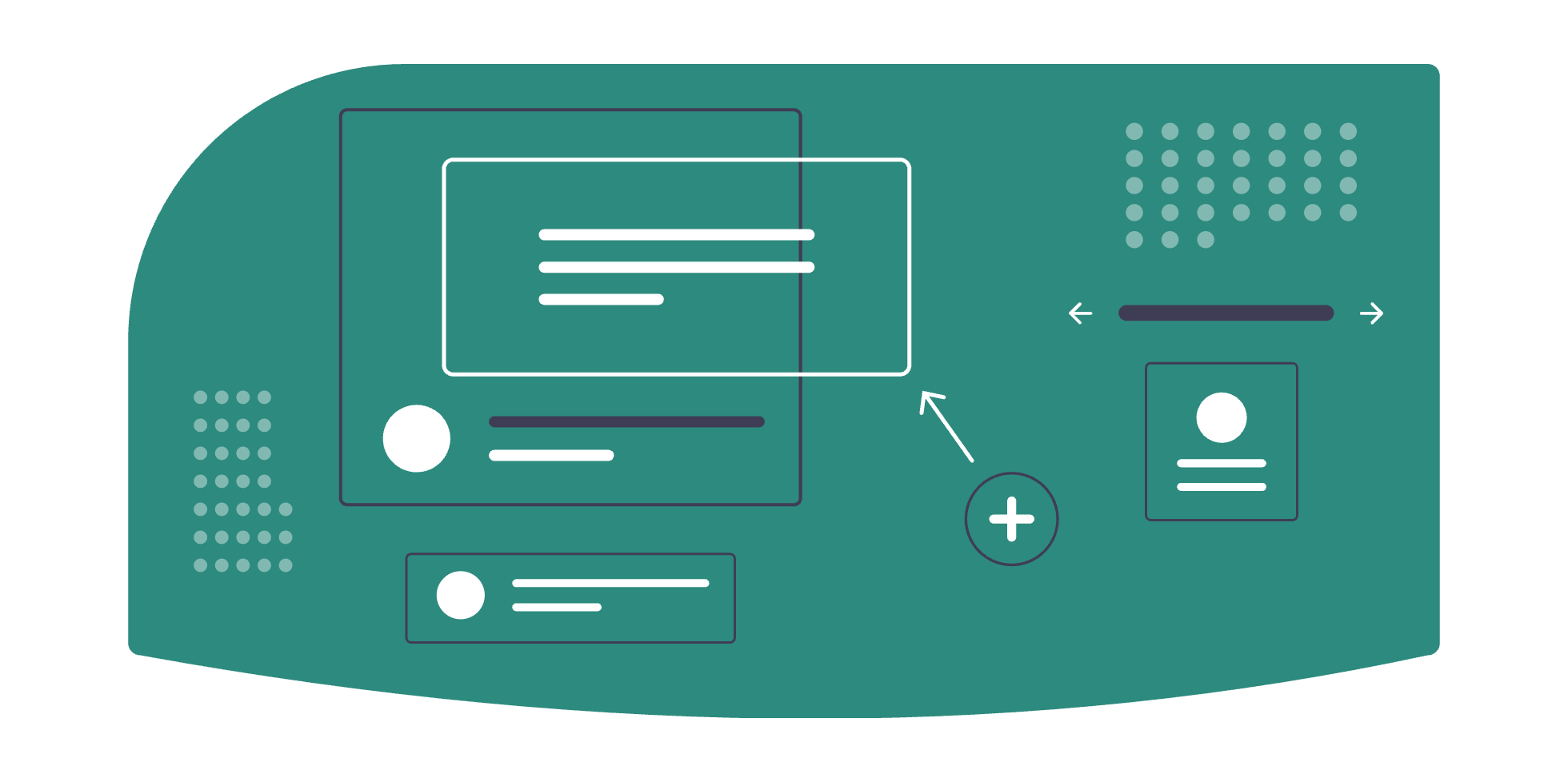
The library, @wdtech/components, currently has 20+ components. Simple things like buttons and inputs, and more complex things like modals and drag-and-drop upload areas. Every component is slot-based and composable, which gives teams the flexibility to use them across a wide range of scenarios without needing to fork or override.
That composability came from one of the more interesting decisions we made. For component families, where a parent and its children need to share state, we use a context composable to hold the internal state rather than passing it down through props. This avoids prop drilling, and more importantly it means children can be ordered and marked up however a team needs while the functionality stays intact. The component family works regardless of how you arrange its parts.
The stack is intentional about dependencies. Vue, TypeScript, Tailwind, and ESLint are standard choices. Beyond that, we kept the footprint small. If something can be handled in-house rather than pulling in an npm package, that's what we do. Every external dependency is a point of failure we're taking responsibility for, and we try to keep that list short.
Design tokens come straight from Figma and are wired in through Tailwind v4, so the styling in code maps to what Design defines rather than drifting from it over time. The package itself is built to be consumed cleanly: it's tree-shaken, CSS is optional and can be imported separately, and components can be globally registered all at once or imported individually as needed.
// register everything at once
import WdTechComponents from '@wdtech/components'
import '@wdtech/components/style.css'

app.use(WdTechComponents)

// or import only what you need
import { WdButton, WdModal } from '@wdtech/components'
The output is minified, compressed, and chunked. Getting a custom library to behave well as a consumable artifact turned out to be one of the harder parts of the whole effort, more so than building the components themselves.
Accessibility#
Accessibility wasn't optional. Every component has to meet WCAG standards, which meant getting ARIA attributes, focus states, and keyboard navigation right from the start rather than bolting them on later. Concretely, that's things like pressing Enter to open the file picker on the upload component, proper focus handling inside modals, and visible focus states throughout. Components also had to match our design system and branding, so we built to the guidelines Design set for branding, contrast, and keyboard interaction. Design reviewed our components visually to confirm they met those standards. A component that passed its tests but didn't match the design system wasn't done.
Quality Gates and Releases#
Quality gates run on every commit via Husky and in the pipeline:
- Formatting checks
- Unit tests
- Browser tests across Chrome, Firefox, Edge, and Safari
- Typechecking
The bar is deliberately high. Reliability and consistency are the whole point of this library, so they have to be enforced automatically rather than left to good intentions.
Releases follow standard semver. Every minor and major version gets its own Storybook instance, complete with documentation, deployed automatically through ArgoCD dynamic deployments. Each release also ships with notes and a changelog that goes out to engineers as it lands, so teams can see what changed and decide when to upgrade. It's still an evolving process, but it's far enough along that teams are comfortable building on it.
The library is open-sourced internally. Any engineer at the company can contribute, and we actively encourage it. There's a defined process for how changes get proposed, reviewed, and shipped, so that openness doesn't come at the cost of quality or stability.
The Role of AI#
Most of the library was built before our teams had meaningful access to AI tools. The architecture and the standards behind it were worked out by people, in meetings and pull requests, before LLMs were part of the workflow.
When AI tools became available, we used them to speed up the remaining build work and improve stability. We also developed skills and rules specifically for the library, tooling that helps engineers understand how to use existing components correctly and how to build new features in a way that fits the established patterns. The goal there is to lower the barrier to adoption, especially for teams picking this up for the first time.
Rolling It Out#
Adoption is gradual and intentional. All new projects are expected to use the library. Projects that are part of our broader WDSuite initiative are being migrated as part of that work. Legacy and deprecated projects aren't being touched; the return doesn't justify the cost there.
Each project has its own adoption plan because the reality varies. Some teams can start integrating components right now. Others have dependency updates, architectural changes, or other groundwork that needs to happen first. We're working through those on a project by project basis.
Not every team has embraced this with enthusiasm. That's expected. Some engineers had strong preferences for the tools they'd been using, tools they picked themselves and knew well. A small number couldn't be convinced regardless of the reasoning, and I don't have a clean answer for that. Organizational change moves slowly, and not everyone will come around. What matters is that the long-term direction is clear and most people are moving in it.
Early Signs#
It's too early for hard numbers. The library was just released, adoption is ongoing, and the real return will show up over time. But the early signals are encouraging.
Two of the projects picking it up aren't part of WDSuite. On one of them, we used the library together with our skills and boilerplate to stand up a fully interactive proof of concept in about a week. Practices we'd defined, components we'd built, branding, keyboard navigation, all of it came together fast. That let us demo a working POC to Product leadership, get real feedback, and ultimately buy ourselves the time and support to build out a more complete product. The week we saved on plumbing went into the parts that actually mattered.
Another team is kicking off a brand new client-facing production project on our practices and components. Reception so far has been positive. None of this is conclusive yet, but it's the kind of early traction that previous attempts never reached.
What I Took Away#
A few things stuck with me, and they're the parts I'd pass on to anyone trying to push a similar initiative through.
A clear idea plus something tangible is what gets you buy-in from leadership. But leadership alone isn't enough. You have to recruit the people who will actually use the thing, get them to buy in, and turn them into advocates. And the whole time, you have to lead with value, not novelty.
"This is cool to build" doesn't move anyone. "Here's what this saves us" does.
Ambitious projects are absolutely doable at scale, but only if you can make the value concrete.
If I started over, I'd set up the quality gates and build the AI skills much sooner. The tools were available when we began, and having that structure in place earlier would have kept things more focused and consistent throughout development.
The hardest part wasn't the code. The engineers on the council are genuinely talented, and the components came together more easily than I expected. The hard parts were politics and packaging. Getting buy-in from engineers who wanted to push their own agendas was draining, and at times egos flared, mine included, and progress slowed because of it. What eventually settled those moments was letting the value speak for itself. The other genuinely hard problem was technical: making the library a clean, tree-shaken, consumable product.
One honest caveat: this custom approach is right for us because of our size. For an agency or a smaller company, it probably wouldn't make sense, and that's fine. The right answer depends on your scale and your problems.
If I had to compress all of it into one piece of advice: once you have an idea, run with it. Get buy-in from your peers and your leadership. Accept feedback from everyone, including the people you fundamentally disagree with. The product comes out better for it.
Where Things Stand#
As of June 2026, integrations are underway. The library exists, works, and is being adopted. That's further than any previous attempt got.
The goal has always been the same: one design language and one component foundation, owned and maintained by us. That means less time rebuilding the same button five different ways, and fewer external dependencies sitting in our stack waiting to go stale. We're not all the way there yet, but the foundation is in place and the direction is set.
More than the library itself, what I take from this is the reminder that the hardest engineering problems at scale are rarely just engineering. Getting people aligned, leading a team of strong engineers through hard decisions, and keeping everyone pointed at the same outcome is the work. The button component was never the hard part.