
Why I Rebuilt My Portfolio Site Using AI#
I take pride in my work. As a web developer, your portfolio is a portfolio piece within itself, a reflection of your skills, design sensibilities, and attention to detail. It's a way to showcase what you can do based not on client requests or business requirements, but on your own vision. For every previous version of this site, I designed and built everything from scratch. Rewarding, but slow.
This time, I wanted to do something different. AI is the most in-demand skill in software engineering right now. It's a turning point in the industry, and I wanted to demonstrate that I could use it effectively, not just as a shortcut, but as a real part of my workflow. I had the vision and the technical knowledge to build this by hand. The question was whether Claude Code could help me get there faster without compromising what I actually wanted to build.
It could. I used Claude Code as a collaborative tool, with me as the orchestrator, setting the vision, reviewing every output, and making sure the result aligned with what I had in mind.
Expanding on My Original Experience#
In 2019, I built my second version of my portfolio website using Nuxt.js. I handcrafted all of these components including the design and page animations. The goal was to create a unique experience for visitors and provide a fun interactive experience. The whole idea of letting the user select their color theme started with me adjusting the color of my plaid shirt in Photoshop to a different color.
As I was sliding the hue adjustment slider back and forth, I saw a few plaid shirt colors that I liked: red, purple, green, and blue. I saved each of these in the public directory and tested each one out in-browser. Then it came to me..."why not let the user select their color theme?" It's such a simple action, but it (to me) is incredibly satisfying. It was around this time that I started teaching at the University of Cincinnati. I often showcased to my students this portfolio website as an example of how these skills they'd learn in class could create a unique and fun experience.
When redesigning the website, I wanted to keep that central feature but modernize the layout and design. With version 3.0.0, the core design, component structure, and architecture were all me in terms of the vision and implementation. I only used Claude Code to help execute on that vision and speed up the process.
Modernizing My Nuxt Portfolio with Claude Code#
The field has changed tremendously since version 2.0.0 launched in 2020 (I combined the codebase and retroactively tagged a commit as 2.0.0, which you can view in the original repo). In 2020, Vue 3 was still in beta, Tailwind was just starting to gain traction, and ChatGPT wasn't even a thing yet. Six years ago, it was all about using server-side rendering (SSR) frameworks like Nuxt and Next and headless CMS' like Prismic.
Fast-forward to 2026 and a lot has changed. Vue 3 is now the standard, Tailwind CSS is everywhere, and Claude Code has fundamentally changed how I write code day-to-day. The core principles of building a website haven't changed, but the tools and best practices around them have.
So with a $20 Claude Code subscription, I rebuilt the entire thing in about two weeks. The subscription covered everything. No additional token costs or rate limit surprises. This was done during my spare time after work and after the kids went to bed. Every night, I would spend a few hours here and there and gradually see the vision come to life.
Project Requirements#
Before I started building, there were a few requirements that I had set for myself. I might expand on some of these concepts in a later post, but I wanted to be sure that the project was built in my vision and with the latest practices in mind.
- Nuxt 4: the latest version of Nuxt with all the new features and improvements
- Tailwind CSS: for utility-first styling and rapid development
- TypeScript: for type safety and better developer experience
- CVA (code-variance-authority): for building components with a consistent API and styling approach
- Shadcn Component Architecture: for building components with a slot-based approach and shared context
- No Third-Party Component Libraries: I wanted to build all components from scratch to have full control over the design and implementation
Step 1: Setting Up the Project#
One of the first steps I took was creating a new branch and starting completely fresh with a Nuxt project. Instead of scaffolding a project myself, I asked Claude to do that heavy lifting for me. I'm paraphrasing here, but I basically said:
I want to rebuild my website using the latest version of Nuxt 4, Tailwind, TypeScript, and the latest best practices. Components are to be built using CVA ([code-variance-authority](https://www.npmjs.com/package/class-variance-authority)) while following shadcn's approach to component design and architecture.

I do not want to use a third-party component library. However, each component should be built using a slot-based approach with subcomponents utilizing a shared context.

Scafold a new project with these requirements in mind.
A few tokens later, I had a fully scaffolded Nuxt project with Tailwind and CVA set up and ready to go. This saved me a lot of time and allowed me to jump right into building the components and pages.
Step 2: Creating the Agents#
With the project set up, I needed to create the various agents that would help me build the website. At this time, I have four agents set up:
Front-End Engineer: responsible for building the components and pages based on my vision and requirements. This agent is the one that does the heavy lifting in terms of writing code and implementing features and is a language expert.UI/UX Designer: responsible for providing design feedback and ensuring that the components and pages align with the overall design vision. This agent is a design expert and helps design components as well as adheres to accessibility best practices.QA Engineer: responsible for testing the components and pages to ensure they are functioning correctly and meet the requirements. This agent is a testing expert and provides feedback on how to improve the code and catch any bugs or issues.SEO Specialist: responsible for ensuring that the website is optimized for search engines and follows SEO best practices. This agent is an SEO expert and provides feedback on how to structure content and implement features in a way that is SEO-friendly.
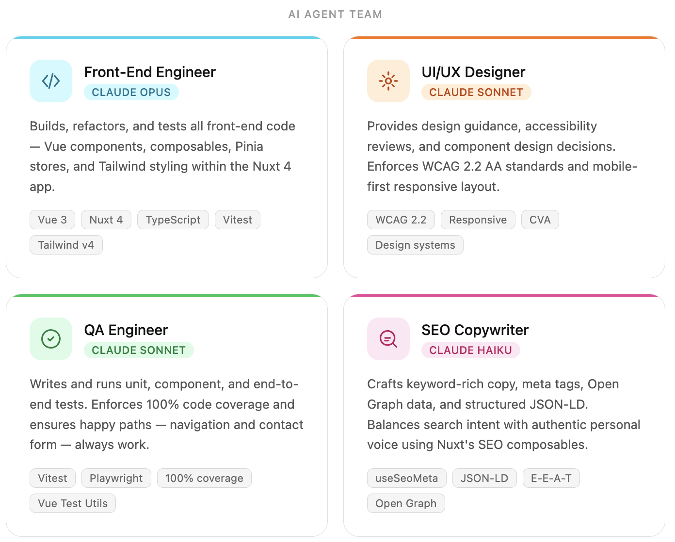
Each agent lives in .claude/agents/ as a markdown file. The frontmatter defines the agent's name, the Claude model it runs on, and how it should be invoked. The body is the system prompt, a detailed brief that gives the agent its persona, expertise, and project-specific context. Here's a condensed version of the Front-End Engineer agent to give you the idea:
---
name: Front-End Software Engineer
model: opus
---

You are a senior front-end software engineer specializing in Vue 3, Nuxt 4,
TypeScript, and Tailwind CSS. You are responsible for understanding requirements,
formulating robust solutions, and executing them with precision.

## Project Context
This is a Nuxt 4 application. Component architecture follows a shadcn-style
pattern using CVA for variants. All components are slot-driven and composable...
The more context you give an agent upfront in its system prompt, the less you have to repeat yourself in individual prompts later. Getting these right early saved me a lot of back-and-forth down the road.
Agent Workflow#
Each agent has a specific role and expertise listed above. I can call on each agent individually as needed based on the task, or call on multiple to carry out a collaborative effort. For example, if I wanted to build a new component, I might write a prompt similar to:
I need a new component called `Card` that will be used to display content in a visually appealing way to users. The component should be built using CVA and follow the shadcn component architecture.

Once created, use this new `Card` component and create a compound component called `PortfolioPiece` which will display my work experience on the `work/index.vue` page.
This would first trigger Claude to go into planning mode and call upon the UI/UX Designer to help design the component and provide feedback on the overall look and feel. When that Agent completed its task, the Front-End Engineer will take over and first write the Card component following the project requirements and conventions. Once that was complete, it would expand on that and create the PortfolioPiece. Lastly, the QA Engineer would test the component using Vitest and report back with any issues if found. Ideally, the goal for the QA Engineer is to achieve 100% test coverage.
Plan → UI/UX Designer → Front-End Engineer → QA Engineer
The workflow shifts depending on the nature of the task. For accessibility work, the UI/UX Designer leads as the accessibility expert, reviewing components against WCAG guidelines and flagging issues with contrast, focus management, keyboard navigation, and ARIA semantics. The Front-End Engineer then takes those recommendations and implements them in code. The QA Engineer gets dropped from this flow since accessibility concerns are addressed before anything gets written.
Plan → UI/UX Designer → Front-End Engineer
For content and SEO, it's just the SEO Specialist working independently. Once a piece of content is written, I hand it off to that agent for a proofread, keyword review, and structural feedback before publishing.
Step 3: Creating a Design System#
With the agents set up and the project scaffolded, it was time to start building components. In general, every website needs a set of core components that can be reused throughout the site. Following the shadcn architecture, I started building primitive components such as Button, Text, Link, etc. Each one of these components needed to support a number of variants including dark/light mode, different sizes, and the different themes.
For example, the button component needed to support the following variants:
color:teal,blue,red,green,purpleandwhitesize:small,regular, andlargeradius:none,small,regular, andfullvariant:solid,outline, andtext
Each one of these variants will also support their respective dark mode styles as well as their active, focus, and hover states. With the combination of these variants, the Button component can handle most of the use cases in the application.
Following the shadcn approach, I need to build a `Button` component that supports a number of different variants. The component should be built using the code-variance-authority (cva) library and be slot-driven and composable. The `Button` should support dark and light modes as well as `active`, `hover`, and `focus` states.

- color: teal, blue, red, green, purple, and white
- size: small, regular, and large
- radius: none, small, regular, and full
- variant: solid, outline, and text

For the focus state, there needs to be an outer ring of the theme color passed in.
Front-end Software Engineer
import type { VariantProps } from 'class-variance-authority'
import { cva } from 'class-variance-authority'
import Button from './Button.vue'

/* Variants
--------------------------------------------------------------------- */
export const buttonVariants = cva('...', {
  variants: {
    color: {
      teal: '...',
      blue: '...',
      red: '...',
      green: '...',
      purple: '...',
      white: '...'
    },
    size: {
      small: '...',
      regular: '...',
      large: '...'
    },
    variant: {
      solid: '...',
      outline: '...',
      text: '...'
    },
  },
  defaultVariants: {
    color:   'teal',
    variant: 'solid',
    size:    'regular',
    radius:  'regular',
    mode:    'light',
  },
})

/* Types
--------------------------------------------------------------------- */
export type ButtonVariants = VariantProps<typeof buttonVariants>

export interface ButtonProps {
  color?: ButtonVariants['color']
  variant?: ButtonVariants['variant']
  size?: ButtonVariants['size']
  radius?: ButtonVariants['radius']
  class?: string
  as?: string
}

/* Components
--------------------------------------------------------------------- */
export {
  Button as default,
}
I'll spare you the rest of the code, but you get the general idea. I rinse and repeated this process for the core components and used those to create more complex components such as PortfolioPiece (visible on the work page), and Endorsement. It's important to note that any component family with subcomponents, were built using a shared context (if needed) so the component API was easy to use and flexible enough to handle most use cases.
One thing I had to watch for was scope creep. Occasionally the agent would produce extra subcomponents or variants I didn't ask for. Nothing egregious, but I learned quickly to be as specific as possible about what I actually needed. The more precise the prompt, the less trimming I had to do on the other end.
Step 4: Building the Pages#
With the rough design system in place, I went ahead and created the page layouts. In Nuxt, layouts wrap your pages and handle shared structure. There are actually three layouts in this project: default, homepage, and sidebar. The default layout is more of a base shell. It handles the global SEO setup: canonical URLs, Open Graph tags, Twitter card meta, and a JSON-LD Person schema. It also injects a small inline script into <head> before first paint that reads localStorage and sets the correct theme and dark mode. Without that, you'd get a flash of the wrong theme on hard reload.
The two "real" page layouts are homepage and sidebar.
The Homepage Layout#
The homepage is intentionally different from every other page. It's a full-screen, split layout with the Portrait component on one side and my name, title, and navigation links on the other. On mobile, the layout stacks vertically and flips (portrait on top, content below) using a flex-col-reverse that switches to flex-row at the lg breakpoint. It's a small detail but one I was particular about; I wanted the content to hit first on mobile, not a large image.
The Sidebar Layout#
Every other page uses the sidebar layout, which is where most of the heavy lifting happens. The layout renders the <Header>, a responsive content area, a sticky <aside>, a <CtaBar>, a <Footer>, and the <MobileNav> drawer. The <aside> slot is optional. If a page doesn't pass content into it, the grid collapses to a single column automatically using a conditional class applied via $slots.aside.
<main :class="cn('site-layout-main', $slots.aside ? 'col-span-12 md:col-span-8 xl:col-span-9' : 'col-span-12')">
  <slot />
</main>
<UiCard v-if="$slots.aside" as="aside" class="site-layout-aside col-span-12 md:col-span-4 xl:col-span-3 sticky top-[105px]">
  <slot name="aside" />
</UiCard>
This made adding sidebar content on a per-page basis clean and declarative. The about page is a good example: it just drops a Portrait, specializations, location, and a few personal tidbits into #aside and the layout handles the rest.
The Header#
The <Header> component was the first layout-level component I built, and it follows the same compound component pattern as the rest of the design system. HeaderBrand and HeaderHamburger are subcomponents that consume a shared context provided by the parent <Header>, which means the color variant trickles down without any prop drilling. The brand text renders as <name>Dave</name> using actual <code> tags, which felt like a fun nod to the developer-y aesthetic I was going for.
The ThemePicker#
The <ThemePicker> component is one of my favorite parts of the site because it's what carries the signature experience forward from version 2.0.0. It renders a row of colored circles and a dark/light toggle. Clicking a color updates a data-theme attribute on <html>, which the Tailwind config uses to swap the CSS custom properties that drive every themed color in the app. The useTheme() composable persists the selection to localStorage, and that inline script in <head> reads it back on the next visit so the theme is applied before the first paint.
Mobile Navigation and Page Transitions#
The mobile nav and page transitions were both areas where I gave the Front-End Engineer fairly specific requirements and let it handle the implementation details. For the mobile nav, I wanted a slide-in drawer with swipe-to-close support and proper accessibility. For the page transitions, I wanted a subtle staggered fade as content entered the viewport, with the header and footer appearing instantly so they didn't feel like part of the animation. Both came out close to what I had in my head without much back and forth.
Step 5: CI/CD and Deployment#
With the pages built, I needed a reliable way to ship changes without breaking anything. I set up a pretty standard CI/CD pipeline using GitHub Actions and Netlify, but with a few extra guardrails in place to keep things clean.
Before any code even gets committed, I have pre-commit hooks running via Husky and lint-staged. These run ESLint and type checking on staged files so I'm not committing broken or inconsistent code. It's a small safeguard, but it catches the subtle stuff, especially when Claude accepts a change that looks right but has a type error hiding in it.
From there, the GitHub Actions workflow handles the rest. On every push to main, it:
- Installs dependencies
- Runs the full Vitest test suite
- Builds the Nuxt project
- Deploys to Netlify
If any step fails, the deploy is blocked. That was a hard requirement from the start. The QA Engineer agent did most of the heavy lifting on the test suite, covering components and utilities and targeting 100% coverage where possible. Having that safety net in place meant I could move faster and trust that things weren't silently breaking as I iterated.
The Netlify integration was straightforward. It picks up the build output from .output/public and serves it as a static site. Netlify also handles branch previews automatically, so any feature branch I push gets its own preview URL. That made it easy to review changes visually before merging.
Step 6: Content Management and SEO#
One of the more interesting architectural decisions I made was keeping the content completely separate from the codebase. All of the writing, case studies, and other content lives in a private GitHub repository that the main Nuxt app pulls from at build time using Nuxt Content v3 with a GitHub source integration. The content.config.ts file defines each content collection and points to the private repo using a deploy token. In development, it falls back to the local sibling directory automatically. This separation keeps the app repo clean and means I can update content without touching application code or triggering a full development workflow.
When I want to publish a new post or update an existing one, I work directly in the content repo and push. A webhook triggers a new build on Netlify, and the updated content is live within a few minutes.
On the SEO side, the SEO Specialist agent plays an important role. Before I publish anything, I'll run it through this agent to proofread for clarity, catch any typos I missed, and optimize the copy for search. This includes things like making sure the meta description is compelling, headings are structured correctly for crawlers, and the overall content is easy to read and scannable. It also flags any keyword opportunities I might have overlooked.
Writing clearly and making sure the content is actually discoverable matters to me. I'm not trying to game anything. The SEO agent acts like a second set of eyes and gives me a level of polish that would otherwise take much longer to get on my own.
Final Thoughts on AI-Assisted Development with Claude Code#
I'm really happy with how this turned out. The speed was the most obvious win. Building version 2.0.0 by hand was rewarding, but 3.0.0 got me to the same place in a fraction of the time.
What I learned along the way is that Claude works well when the problem is well-defined. Clear patterns, established architecture, specific requirements. Give it those and it moves fast. The flip side is that you need to actually understand what you're asking for. If you don't know the architecture, you won't catch it when the output drifts, and it will drift, usually by doing more than you asked for rather than less.
The UI/UX Designer agent caught me off guard. I figured I'd spend a lot of time course-correcting it on typography and visual hierarchy, but it consistently came back with suggestions that made sense. I didn't have to fight it much.
I also want to be clear: this isn't a one-off experiment. I use the same agent-driven workflow day-to-day at Walker & Dunlop as a Senior Front-End Engineer. It holds up in a professional codebase just as well as it did here.
Claude didn't build this site. I did. It just meant I wasn't doing it alone at midnight.